If you’re feeling overwhelmed trying to choose a t-shirt and ink color combination to use for your next design, don’t worry – we are here to help you out!
With so many options to choose from in our design tool, we know it can seem difficult, at first, to decide on a color combination that you love. With a little guidance from our design team, you will be able to find the perfect color combination in no time.
To find inspiration for your t-shirt design, explore 12 of our favorite t-shirt and ink color combinations that work every time!
Key Takeaways
- Choosing the right t-shirt color combination is a critical design step that impacts your design’s readability, visual appeal, and overall success.
- There are concrete design principles behind great color palettes. High-contrast combinations (i.e., light ink on a dark shirt or using complementary colors) make designs more vibrant, while using analogous colors brings harmony to the design.
- Following these principles and incorporating modern design trends will give you a proven starting point for your design.
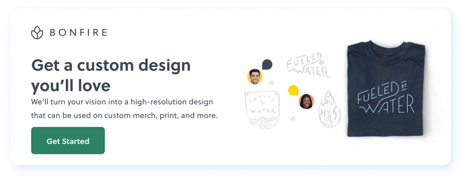
Ready to start designing?
Start making your own premium custom merch for free on Bonfire.
What is the best way to choose t-shirt design color combinations?
Understanding the basic principles of color theory can cut the time you spend choosing color combinations in half. This simply involves understanding the color wheel and the relationships between colors.
There are three types of colors in the color wheel:
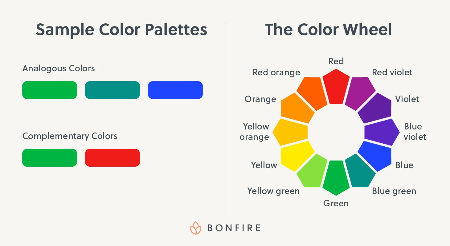
- Primary colors: Red, blue, and yellow
- Secondary colors: Violet, green, and orange
- Tertiary colors: Red violet, blue violet, yellow green, blue green, yellow orange, and red orange
Additionally, there are names for the colors’ relationships with one another on the color wheel:
- Analogous colors: Colors that are next to each other on the color wheel (typically in groups of three). These colors naturally blend together, creating a more harmonious design.
- Example: Green, blue green, and blue
- Complementary colors: Colors that are opposites on the color wheel. When used together, they contrast strongly and create designs that stand out.
- Example: Green and red
Using a color wheel can help you choose a basic palette that suits your design—from there, you can play with different shades and hues until you find the exact colors you like.
Can’t Decide on Colors?
What colors go well together on a shirt?
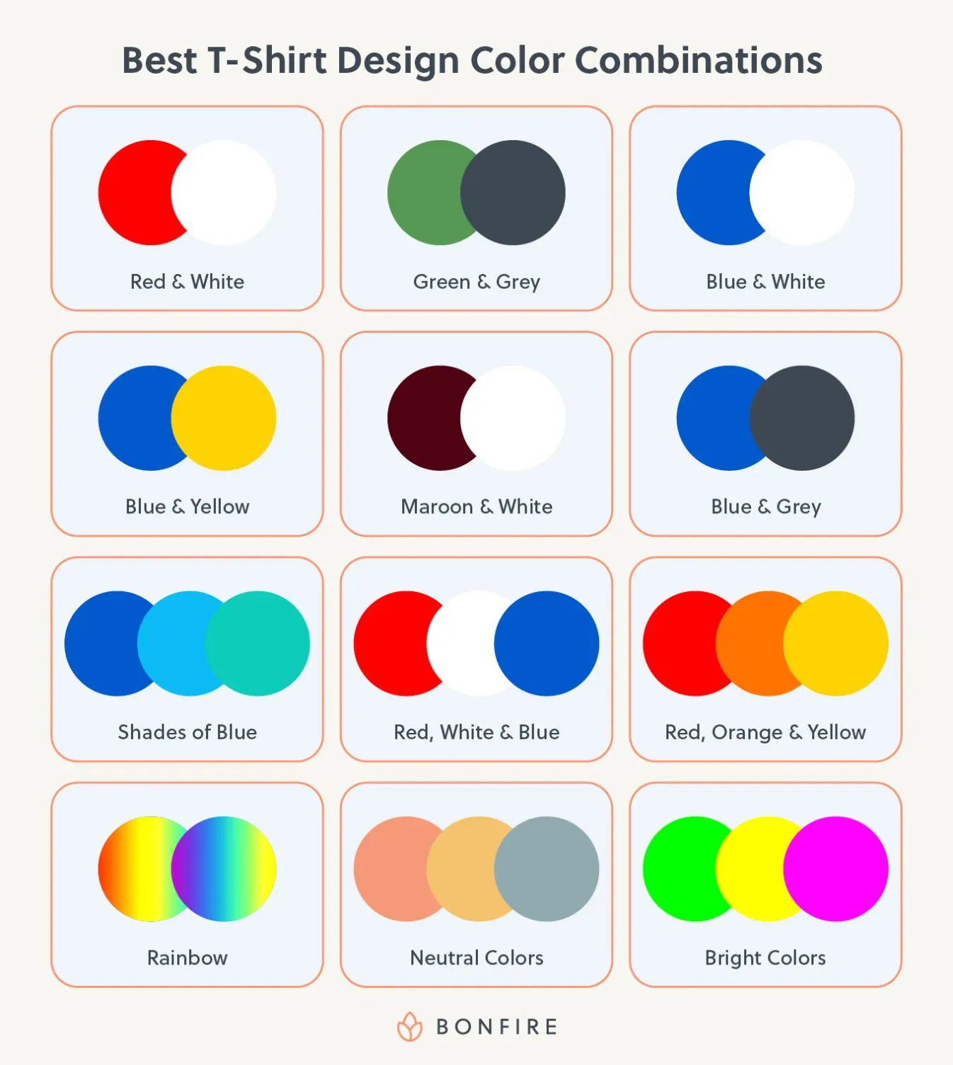
1. Red & White

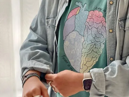
This color combination is a great choice to make a design really pop. Delicate line work shows up best when there’s a strong contrast between the ink color and the color of the t-shirt fabric. So any bright color ink printed on white apparel, or white ink printed on a dark shirt color will always look sharp. Design a red and white shirt.
2. Green & Grey


There’s just something about green Ink on grey clothing. Whether the green you use is more earthy or leaning toward Kelly Green or teal, it’s sure to look awesome on our grey apparel options. Our favorite green color combination is Kelly Green on our light or dark grey Crewneck Sweatshirts. Design a green and grey shirt.
3. Blue & White

Blue and White is a classic pairing and works in both combinations (blue ink, white shirt, or white ink, blue shirt!) They have great contrast together, so your artwork is sure to look sharp, even with the smallest text. Design a blue and white shirt.
Try these color combos in our interactive design tool
4. Blue & Yellow


Putting blue and yellow together makes a very pleasing color combination. The warmth of yellow tones meets with the cooling effect of blue tones to create a lovely balance. Design a blue and yellow shirt.
Pro Tip from Our Designers:
To add complexity, use a few shades of yellow and blue to really explore that complementary relationship even more.
5. Maroon & White

These colors pair so well together because of the high contrast between the maroon and white. Maroon shirts allow white designs to really shine, which is especially helpful when a design has delicate and thin lines. Bonfire’s Maroon Crewneck Sweatshirt is an awesome apparel item to print on to achieve this look. Design a maroon and white shirt.
6. Blue & Grey


Combine blues and greys to create a shirt that feels cool in tone. Because there are so many colors in the realm of blues and greys, and because we have so many types of blue and grey shirt colors to choose from, your possibilities are endless for this color combination. Design a blue and grey shirt.
7. Shades of Blue

Blue shirts are some of our best-selling products and for good reason. Blue ink on blue shirts always ends up looking great together. Just make sure that the blues being used have enough contrast so that the entire design will be visible on the shirt. Try light blue ink on a midnight navy tee, or royal blue ink on an ice blue tee. Design a dark blue and light blue shirt.
8. Red, White & Blue


While on paper this color combination sounds limited to patriotic designs and flags, in practice it ends up working out really well for all sorts of designs. The primary colors of red and blue balance out well with the neutrality of white. Design a red, white and blue shirt.
9. Red, Orange & Yellow

These warm tones, when combined, create beautiful designs that feel fun and energetic. Print a design with these desert-like tones on a similar colored apparel item, or neutral-toned tee for more balance between the shirt and design. Looking for more contrast? Choose a dark blue or purple to play off the reds and yellows in your design. Design a red, orange, and yellow shirt.
10. Rainbow

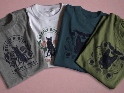
Color is fun, so if you don’t want to limit yourself, make the most of our 8-color limit. Something to keep in mind though, the price to screenprint is calculated on a per-color basis. To maximize your campaign profits, we suggest keeping your color count down, especially if you’re using your shirt sales to raise money for a cause. But you can still play with colors, even if you only use 4 or 5 colors. Design a rainbow-colored shirt.
11. Neutral Colors


Earthy neutrals inspired by the colors of the land, sea, and sand combine so well together. If your design features images of nature, using a palette of earth tones carries on the message and tone of the shirt. Our Light Olive and Stone Grey both serve as fantastic backdrops for your neutral design. Design a shirt with neutral colors.
12. Bright Colors

Neon inks and bright shirt color combinations might not be right for all campaigns and causes, but going bright is a great way to create a shirt that exudes energy and positive vibes. Tahiti Blue and Neon Green are our most vibrant Unisex Tee colors, but the True Royal and Red Triblend Slouchy Tanks are super bright as well! Design a shirt with bright colors.
No matter what ink and shirt colors you’re thinking of combining, make sure that there’s high contrast between the color of the apparel and the design being printed on the shirt. We’ve also written a super helpful guide about optimizing your design for print if screen printing is a new thing for you.
Ready to start creating your shirt?
Jump into our design tool to get started for free.

Joe is the Director of Growth Marketing at Bonfire and has over 8 years of experience in the custom merchandise and apparel fundraising space. His favorite shirt color is Kelly Green, and he prefers hoodies over crewneck sweatshirts.